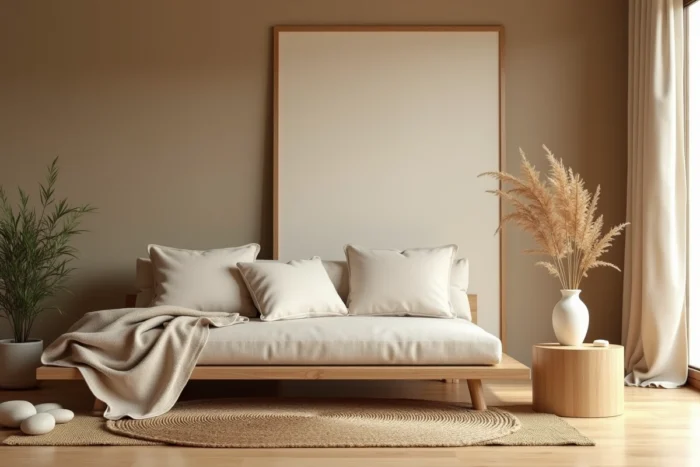
The choice of decor resources for a zen home is not limited to piling up advice on minimalism or neutral colors. The challenge lies in the technical coherence between materials, color palettes, and volume management, three axes that, if poorly articulated, produce a bland rather than calming interior.
Environmental labeling and zen furniture: a regulatory constraint to integrate
We observe that most zen decor guides overlook a structuring parameter: the environmental labeling applicable to furniture. The system, driven by the Climate and Resilience law, gradually requires furniture manufacturers to provide information on the ecological impact of their products. For those looking to create a zen interior with natural and sustainable materials, this regulatory framework becomes a relevant selection filter.
A solid oak piece certified PEFC does not have the same environmental score as a bamboo-faced particle board. Reading the environmental label allows you to verify that the marketing claims (“natural,” “eco-friendly”) correspond to a measurable reality. Specialized resources that combine regulatory data and zen aesthetics remain rare, but they are becoming increasingly relevant for informed purchasing.
Among the catalogs that document this intersection between zen decoration and material traceability, the resource maisonkalixo.fr on Zen and Deco offers a useful thematic directory to identify suppliers consistent with this requirement.
Zen color palettes 2026: beyond beige and white
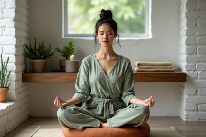
The “all off-white” reflex often produces cold spaces, lacking the warmth that a zen atmosphere implies. The 2026 nature-oriented palettes provide a more nuanced response, structured around three complementary tones.
- Sage green: a key color for plant-based calm, it works well as a flat color on an accent wall or in textiles (cushions, linen curtains). It avoids the monotony of sandy shades while remaining in an organic range.
- Soft terracotta: this hue brings earthy warmth without saturating the space. We recommend it in small touches (ceramics, plant pots) rather than as wall paint, as its intensity can quickly dominate a room.
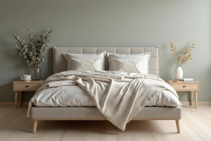
- Slate blue: it offers a mineral depth that anchors a living room or bedroom. Paired with light wood, it creates a subtle contrast, far from the stark black/white oppositions that contradict the zen spirit.
A common mistake is to combine these three shades in the same room. Two natural tones maximum per space are enough to create harmony. The third color, if it appears, should remain confined to an isolated object.
Slow decor and layout resources: sorting useful references
Slow decor, which has emerged as the structuring evolution of zen interiors since 2025, is based on a simple principle: decorate less but better, with natural materials and airy volumes. This approach changes the way we search for decor resources.
A blog that offers twenty wall decoration ideas per article does not align with this logic. We prioritize resources that document the origin of materials, the durability of finishes, and texture combinations rather than the accumulation of visual inspirations.
Platforms like Pinterest remain useful for the visual exploration phase, but they do not provide information on the quality of washed linen or the durability of a lime plaster over time. Detailed product sheets are more valuable than mood boards when it comes to creating a sustainable zen interior.
Materials to document before purchase
Wood, linen, natural stone, and ceramics form the material foundation of a zen layout. For each, the relevant decor resource is one that provides information on the weight (for textiles), the type of finish (oil, wax, matte varnish), and compatibility with household maintenance constraints.
An oiled oak floor does not have the same appearance or maintenance as a matte varnished oak. This distinction, rarely addressed in mainstream articles, conditions the calming nature of a floor over time: a varnished surface that chips after a few years produces the opposite effect of the serenity sought.
Feng shui and living room layout: what serious resources document
Feng shui applied to the living room is the subject of very uneven content online. Reliable resources stand out by a simple criterion: they treat furniture placement as a matter of physical and light circulation, not as an esoteric system.
The sofa positioned against the wall and facing the entrance of the room forms the basis of a functional feng shui living room. This principle is not mystical: it reduces the feeling of exposure, promotes a resting posture, and frees up central circulation.
The resources that deserve attention are those that integrate the Bagua map as a spatial organization tool, crossing living zones and functions (rest, exchange, work). A guide that merely states “place a plant in the southeast for prosperity” without explaining the concrete impact on furniture arrangement misses its target.
Natural light and energy of the space
The management of light remains the most under-documented parameter in zen decor resources. A natural linen curtain filters light without extinguishing it, which maintains the visual connection with the outside, a pillar of well-being in a zen interior. Conversely, blackout double curtains, often recommended for the bedroom, create a total break with the natural light cycle.
Prioritizing sources that detail the light transmission indices of textiles, rather than those that limit themselves to “opt for light shades,” constitutes an effective quality filter for selecting layout resources.
The quality of a zen decor resource is measured by its ability to connect an aesthetic choice to a technical consequence: maintenance, durability, thermal comfort, circulation in the room. Guides that stop at the ambiance image leave the reader without the keys to transform inspiration into sustainable layout.