A living room wall that seems dull despite carefully chosen furniture, a bedroom where the textiles provide no particular sensation to the touch: these concrete situations reveal a gap between what we see in magazines and what we experience at home. Trendy decoration is not just about following a color palette. It involves choices of materials, volumes, and atmospheres that truly transform the daily use of an interior.
Sensory decoration: when tactile comfort takes precedence over pure aesthetics
There is much talk about colors and styles, but the most underestimated trend concerns what we physically feel in a room. Tactile materials (wool, linen, velvet, ceramic) are no longer chosen solely for their appearance. They respond to a need for acoustic, thermal, and tactile comfort in everyday life.
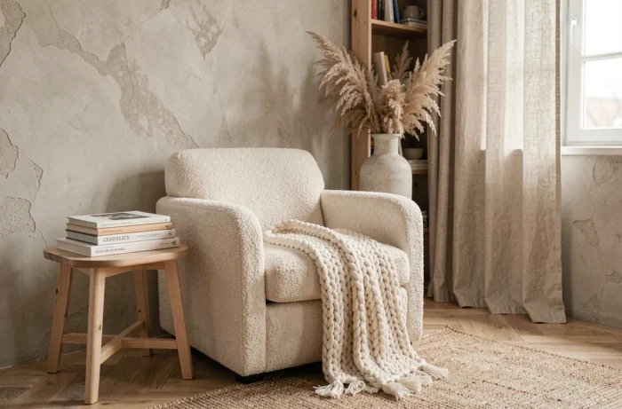
A corduroy sofa does not have the same effect as a smooth polyester model, even if both display the same shade. Crumpled linen on a cushion absorbs sound differently than a stretched synthetic fabric. You can easily test the difference by placing your hand on two different textiles in a showroom: the perceived temperature varies immediately.
In practice, we now prefer thick linen curtains over fine sheer ones, boucle wool throws on an armchair, or handmade ceramic tiles in a bathroom. Each room gains character as soon as we introduce at least two different natural textures. Feedback on this point varies depending on the size of the room, but the effect also works in a small space if done correctly.
To explore ranges of textiles and objects suited to this approach, you can find references covering several types of natural materials on the concept-deco.com website.
Panoramic wallpaper and green living rooms: two decor trends on the rise
Data from Houzz reported by La Voix du Nord shows a clear increase in French searches for panoramic wallpaper and green living rooms between the first quarters of 2024 and 2025. These figures measure internet users’ interest rather than sales, but they indicate a shift towards more enveloping and nature-inspired decor.
Panoramic wallpaper radically changes the perception of a space. Placed on a single wall of the living room or bedroom, a foliage or landscape pattern creates a depth that paint alone cannot reproduce. A common mistake is to place it on a wall cluttered with furniture: you then lose half of the visual effect.
Green as the guiding thread of the living room
A green living room is not limited to repainting four walls in sage green. The successful approach combines several elements:
- A deep green (sage, olive, or emerald) on an accent wall or a main piece of furniture like the sofa, to anchor the palette without saturating the room
- Green plants of varying sizes, arranged at different heights (floor, shelf, hanging), which bring relief and an organic link to the chosen color
- Raw materials as complements (light wood, rattan, natural stone), which prevent the green from appearing artificial or too monochrome
- Textiles in neutral tones (beige, ecru, off-white) to balance the intensity and create areas of visual breathing
This type of composition works particularly well in north-facing rooms, where the cool natural light enhances deep greens without making them dull.
Handmade ceramics and crafted objects: the anti-standardization
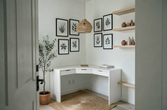
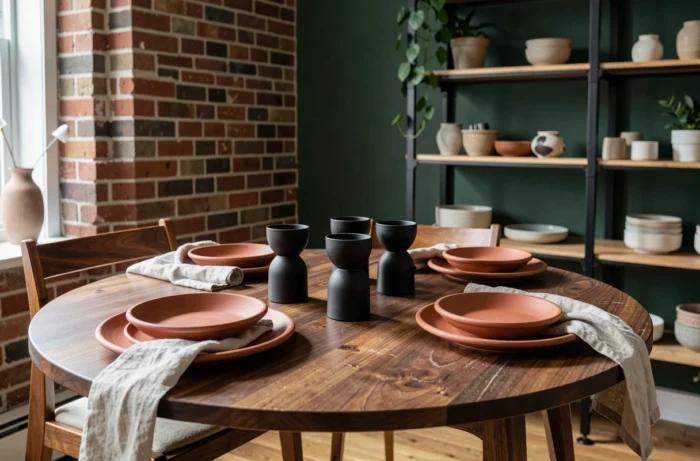
The Maison&Objet 2026 show highlighted ceramics as the preferred material against standardized production. We observe a concrete movement: decorative objects made or finished by hand are replacing identical industrial accessories from one interior to another.
A hand-turned ceramic vase features surface irregularities and color variations after firing, making each piece unique. Placed on an entry console or a coffee table, it creates a focal point that mass-produced objects do not produce.
Integrating ceramics without turning your interior into a gallery
You don’t need to collect expensive pieces. Two or three handmade ceramic objects are enough to change the ambiance of a room. The principle: place them in areas of visual passage (entryway, living room windowsill, kitchen countertop) where the eye naturally rests.
When paired with raw wood or linen, ceramics enhance the tactile atmosphere mentioned earlier. When combined with matte black metal, they take on a more contemporary character. The choice of neighboring material radically changes the perceived effect, more than the shape of the object itself.
Space personalization: going beyond ready-made palettes
The demand for personalization is progressing beyond simple color suggestions. It is observed that the most successful interiors do not follow a single style from A to Z, but mix elements from different registers with a clear guiding thread.
This guiding thread can be a dominant color, a type of material (all wood and natural fibers, for example), or a principle of arrangement (low horizontal lines, rounded volumes). The idea is not to coordinate everything, but to have a criterion of coherence that guides each addition.
- Choosing a dominant material that appears in at least three rooms (light oak in the living room, kitchen, and bedroom, for example)
- Limiting the palette to three main colors plus one accent color, to avoid visual cacophony
- Embracing intentional contrasts: a mismatched vintage chair in a modern interior creates a point of interest, not a mistake
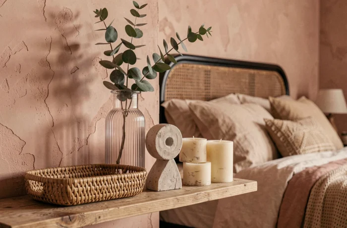
Trendy decoration in 2026 is less about catalogs and more about choices of textures, artisanal materials, and personal compositions. An interior that provides a pleasant physical sensation, where each object has been placed according to a clear principle, remains relevant well beyond a season.